Overview
Enterprise Keyboard Design Studio is a cloud-based tool within the ZDNA console for creating customized key layouts to enhance an application and promote efficient and accurate data entry. Layouts created with EKB Design Studio work on Zebra Android devices that use Zebra's Enterprise Keyboard (EKB) 4.1 (or later), and can be displayed programmatically using Android intents or through DataWedge 7.4.4 (or later).
Each design can deliver as many as six (6) key layouts to a device, each of which can be customized according to business needs and invoked when specific input situations arise (see below). DNA Cloud licensees can create an unlimited number of designs*, but a device can contain no more than one (1) design file at a time. Once finalized and marked as "Complete," designs can be deployed across an enterprise using ZDNA, Zebra StageNow or a company's own EMM system.
* Unlicensed users are limited to five (5) designs.
Custom Layout Use Cases
- Numerical and/or symbolic input
- Function-key and/or scanner input
- Entering technical or industry-specific terms
- Specialized designs with custom colors and/or levels of transparency
- Layouts of custom sizes or shapes (e.g. narrow, vertical, horizontal, etc.)
- Customized "canned" responses that pop up in a list when a button is pressed
Sample Layouts
 Click image to enlarge, ESC to exit.
General Usage Notes
- To display EKB Design Studio layouts on a device, Enterprise Keyboard must be installed on that device and set as the default input source.
- Designs can be exported in a single encrypted file for deployment.
- The design name becomes the file name, with “
.encrypted” as the file extension (e.g.myTC58Layouts.encrypted). - A device can have NO MORE THAN ONE (1) DESIGN FILE installed at a time.
- The design file must be stored in the following device location:
/enterprise/device/setting/ekb/config - Do NOT deploy empty key layouts; they can cause Enterprise Keyboard to behave unpredictably.
- Do NOT deploy layouts with keys that lack an assigned action.
- When custom layouts are displayed, all EKB settings, preferences and functions are suspended.
- If a custom layout is the default, an input method editor (IME) change request from the Google keyboard sets that custom layout as the default.
- Do NOT use the following layout names (reserved for system use):
- "abc"
- "123"
- "#*/"
- "scan"
Usage Recommendations
- Zebra recommends targeting devices running Android 11 or later.
- To maximize performance, the menu sidebar of the Design Editor should be collapsed when editing a layout.
- Layout names should not be more than five (5) characters long.
- Rendering of the System Bar in the device simulator is based on bar height required by TC22, TC53, TC78 and similar devices. Height might vary after deployment, and is determined by the device and its resolution setting. Also see Known Issues, below.
- Using the same orientation for all layouts in a design ensures the most accurate key positioning when deployed.
Known Issues
- Loss of configuration settings has occasionally been observed with excessive button resizing and/or repeated use of undo/redo.
- The System Bar in vehicle-mount devices occupies 10–15% more height than is displayed in the device simulator.
DataWedge Notes
The DataWedge service is included on every Zebra device and when enabled, allows any application on the device to acquire data from device scanners and other input sources. The following rules apply when DataWedge is used.
- DataWedge default layout settings take precedence over those set by EKB.
- If DataWedge is enabled when a custom layout file is deployed, the EKB fixed layout is shown when an input field gets focus.
- If DataWedge is enabled after a custom layout had been set as the default, the DataWedge setting is enabled and takes precedence.
- If DataWedge is disabled after a custom layout file is deployed, the custom file must be redeployed to use that custom file as the default layout.
- When using DataWedge to switch layouts, the EKB fixed layout is sometimes shown briefly or until the focus changes again.
Known Issues
- The "Switch-Scan" Press Action (intended to invoke the EKB "scan" layout) sometimes brings up a different layout.
- When opening a layout using the "Switch-abc," "Switch-123," "Switch-#*/" and "Switch-Scan" Actions, the layout tab name shown is sometimes NOT that of the layout being displayed.
- Use of switch actions (Switch-abc, Switch-123, etc.) requires the respective tab(s) (Alpha, Numeric, etc.) to be enabled in Enterprise Keyboard Preferences on the target device(s).
- The order of layout names shown in the EKD layout menu can vary from the list returned by the
GET available keyboard layoutsintent API. See Enterprise Keyboard APIs for details. - Deployed layouts sometimes look slightly different than their appearance in the device simulator.
The terms “button” and “key” are used interchangeably in this guide.
I. Create a Design
From the Design Studio section, launch the Enterprise Keyboard Design Studio utility:
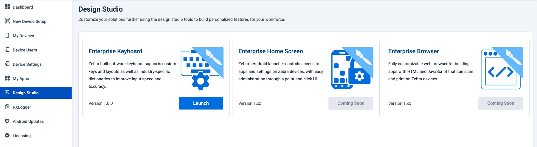 Click image to enlarge; ESC to exit.
Click the “New Design” button:
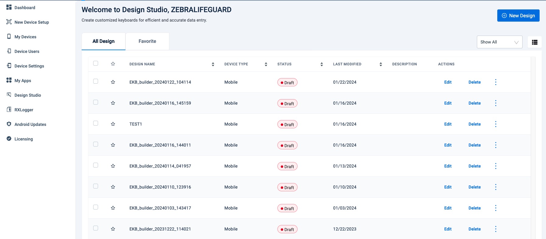 Click image to enlarge; ESC to exit.
Enter a name (or accept auto-generated default). Add a brief description and select the device type and click “Continue” to proceed.
Once a design is created, its device type cannot be changed. Device orientation is selected on the next screen.
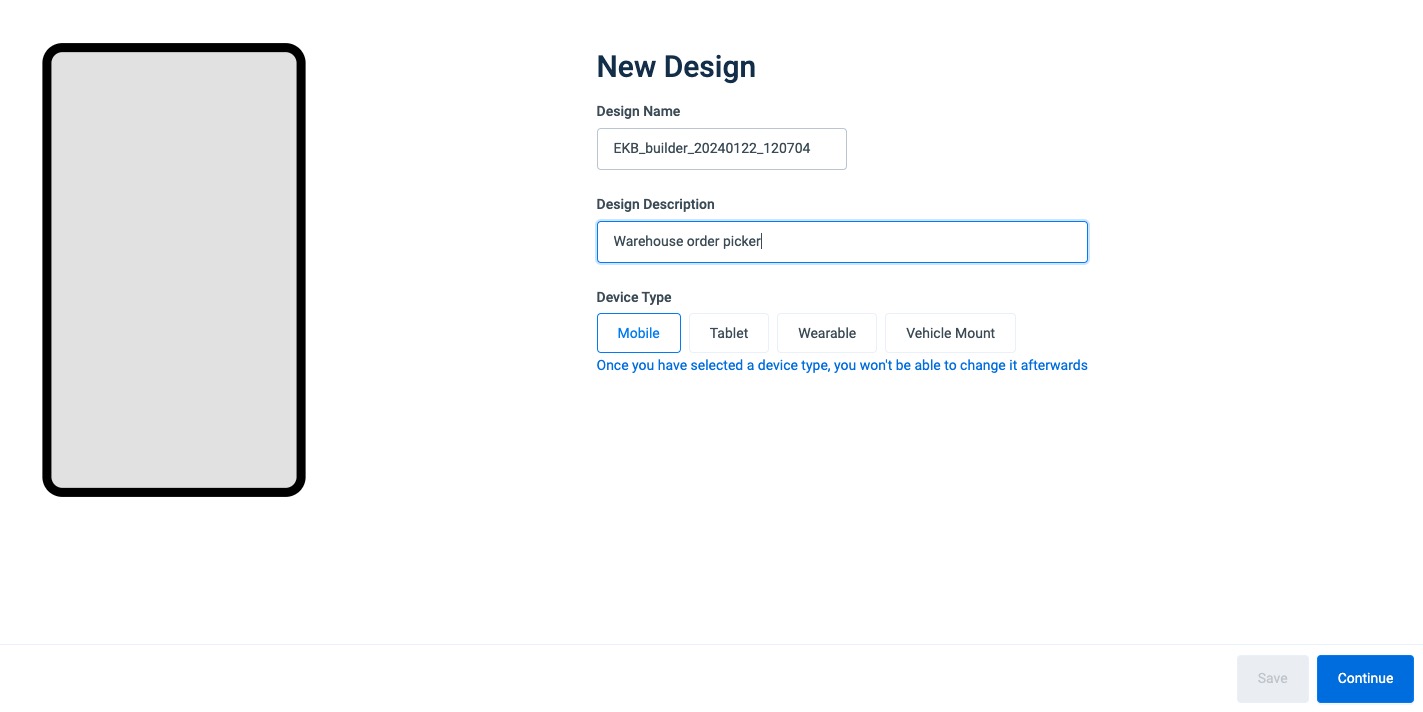 Click image to enlarge; ESC to exit.
Select intended orientation, layout name* and grid dimensions and click “Continue” when finished.
Each design can contain as many as six (6) custom key layouts, each with its own tab on the keyboard.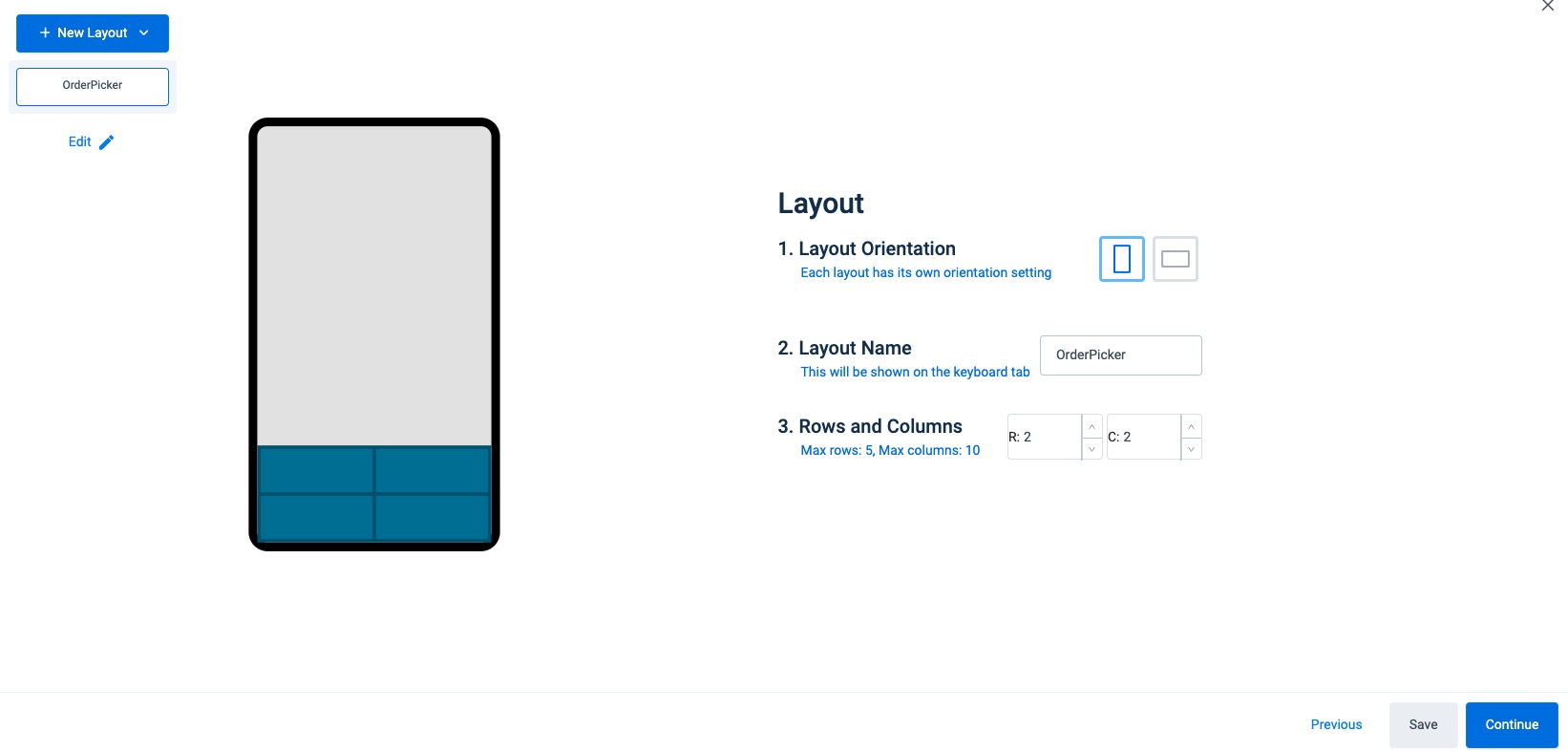 Click image to enlarge; ESC to exit.
* See General Usage Notes, above for layout naming restrictions, above. Zebra recommends layout names of five (5) characters or less to maximize tab visibility.
II. Create and Edit Layout(s)
Design Editor
 Click image to enlarge, ESC to exit.
Design Editor Notes
- In the layout editing panel the upper-most layout is displayed by default when the design is invoked on the device.
- Layout tabs (see "L1, L2..." above) appear only in designs containing two or more layouts.
- Maximum number of rows per layout: 5
- Maximum number of keys per row: 10
- Maximum undo/redo functions: 10
- The undo "stack" stores actions only for the active design; switching designs resets the stack.
NOTE: The on-screen device simulator updates automatically as values are selected or changed.
Configure Key Settings
On the Keyboard tab of the settings panel, select desired values for:
a. Background Color (of space between keys)
b. Keyboard Transparency (applies to layout keys and background)
c. Keyboard Position (controls where layout is anchored on device screen)
d. Preview (enable to briefly display a key's value when pressed)
e. If desired, click "+ All Layouts" to replicate selected attributes to all layouts in the design.
See Keyboard Properties section below for more information.
Click "Save" button when finished. Then select "Size" tab to continue.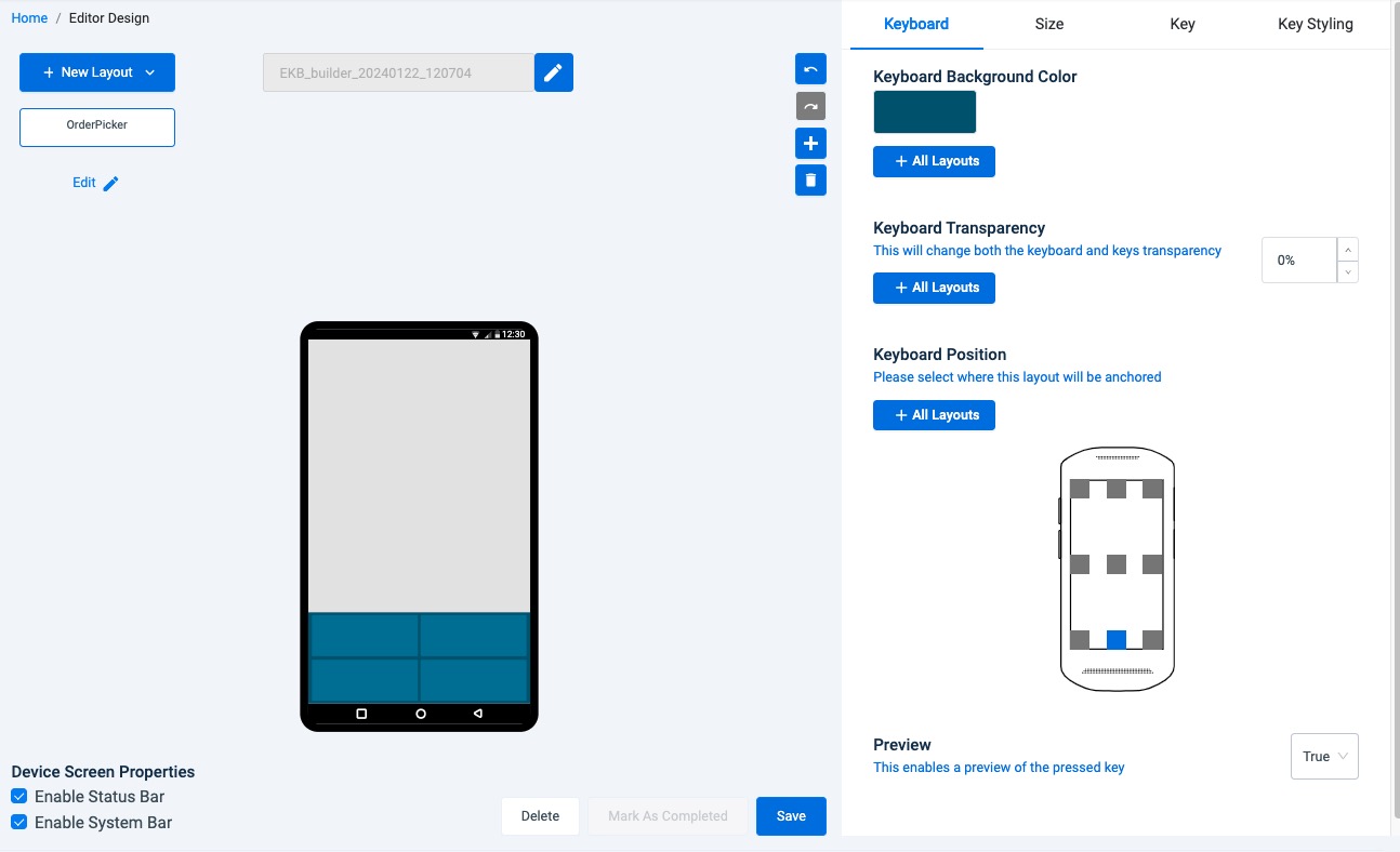 Click image to enlarge, ESC to exit.
On the Size tab of the settings panel, select desired values for:
a. Margins and Spacing (adjusts gaps between keys and margins on device edges)
b. Keyboard Height (select "Size Manually" to drag height in simulator)
c. Keyboard Width (select "Size Manually" to drag width in simulator)
Click "Save" button when finished. Then select "Key" tab to continue.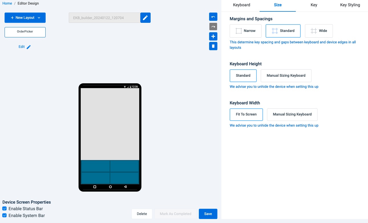 Click image to enlarge, ESC to exit.
On the Key tab of the settings panel, select a key in the simulator and set the desired values for:
a. Primary Key Content (displayed as the primary key label)
b. Secondary Key Content (displayed as the upper-right corner key label)
c. Press Action (determines the type of press required to perform the Action)
d. Action (determines the Action performed by the selected Press Action)
See Key Actions section below for more information.
Click "Save" button when finished. Then select "Key Styling" tab to continue.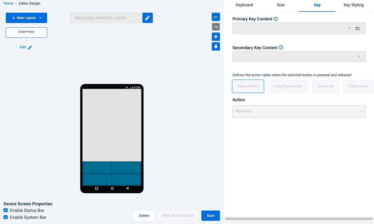 Click image to enlarge, ESC to exit.
On the Key Styling tab of the settings panel, select a key in the simulator and set desired values for:
a. Font (typeface for the primary and secondary key labels)
b. Key Color (color of key when NOT pressed)
c. Key Color When Pressed (key returns to Key Color when released)
d. Haptic Feedback (enables device vibration and duration on keypress)
e. If desired, click "+All Keys" to replicate selected attributes to all keys in the layout.
f. If desired, click "+ All Layouts" to replicate selected attributes to all layouts in the design.
See Text Properties and Style Properties sections below for more information.
Click "Save" button when finished.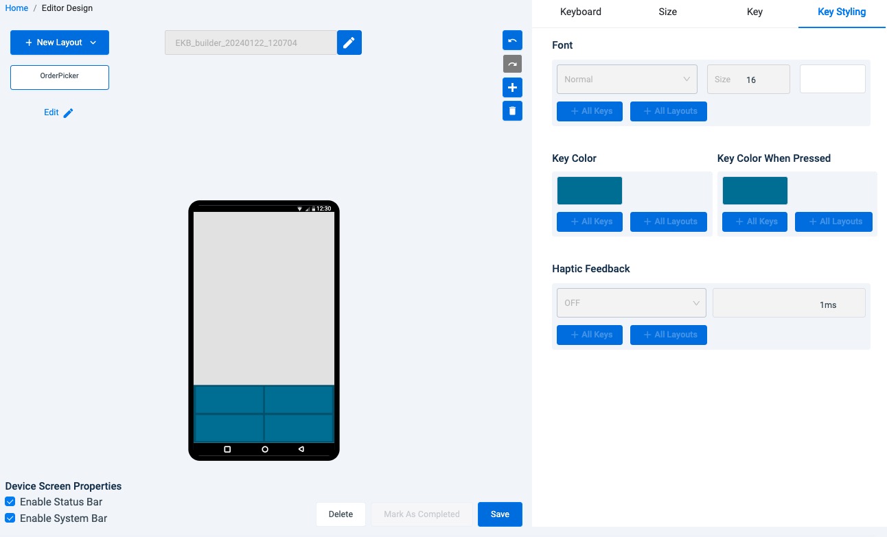 Click image to enlarge, ESC to exit.
Repeat Steps 1–4 above for each layout until all desired settings are configured.
Click "Save" button, then click "Mark As Completed" button.
 Click image to enlarge, ESC to exit.
At this point, EKB Design Studio presents a warning if one or more buttons are not assigned an action, and indicates that no further editing is allowed if the design is marked as completed.
Once a design is marked as "Completed" no further editing is allowed and the "Export" button appears.
Zebra strongly recommends testing layouts on a small number of devices before wider deployment.
If no testing is required, SKIP TO STEP 8.To test a nearly completed design, click "Continue Editing" (as on image above), then Click "Home" to return to the Home screen:
 Click image to enlarge, ESC to exit.
On the Home screen:
a. Identify the design in progress (indicated as "Draft") and click duplicate from the menu to make a copy (see image below).
b. Select Edit on one of the copies and click the "Mark as Completed" button to enable deployment.
c. Deploy "Completed" design to one or more devices representative of those to be targeted.
d. Test the "uncompleted" design on device(s) and edit as needed.
e. With input from device testing, return to Step 5 and repeat until all layouts in the design perform as required.
f. When testing is completed, proceed to Step 8.
 Click image to enlarge, ESC to exit.
Save design changes, select "Mark as Completed" and proceed to the next section to deploy the design.
II. Deploy Design
Designs marked as "Completed" can be deployed directly from within DNA Cloud or exported and deployed using Zebra StageNow or a company's own EMM system. DNA Cloud also supports direct deployment of "Project" files made with Enterprise Keyboard Designer, Zebra's legacy designer tool for Windows. Both processes are documented below.
When exported, design data is stored in a single file called
[design name].encrypted.
Deploy with DNA Cloud
Applicable only for devices enrolled in DNA Cloud
From the Design Studio Home screen, select "Deploy" from the menu:
 Click image to enlarge, ESC to exit.
DNA Cloud creates an EKB deployment Profile and jumps to "Configure App" options (see below).
a. Scroll down to expose the "Add Custom Keyboard Layout" option.
b. Confirm that the pre-populated design name is correct.
Click "Next" to continue: Click image to enlarge, ESC to exit.
To select a different design:
a. Click "Browse" and navigate to the desired EKB Design Studio design.
~OR~
b. Click "Legacy Layout File..." and navigate to a Project made with Enterprise Keyboard Designer for Windows.
Click "Next" to continue.- Go to Zebra Collection App Setup, Step 6 to complete the process.
Export for StageNow, EMM
The data for custom key layout(s) is stored in an encrypted file generated by EKD Design Studio.
Only one design file is permitted on the device; all required layouts MUST be stored in that single file.
Export a key layout design:
Select "Export" from the EKB Design Studio Home screen or the Design Editor screen (shown below).
Save the exported file on the administrator workstation using the default[design name].encryptednaming or rename file as desired. Click image to enlarge, ESC to exit.
Deploy the file using Zebra StageNow or an EMM system, following the existing EKD deployment process.
Properties
Keyboard Properties
- Background Color - Specifies the color of the key layout. Changes appear in the layout immediately after clicking OK in the color picker.
- Transparency - Used to select of the transparency from 0 (opaque) to 100 (fully transparent) of the key layout Background using a slider. Changes appear immediately.
- Keyboard Position - Determines where on the device to anchor the layout(s). Can be set separately for each layout or for all.
Key Actions
- PressAction - Defines the action taken when the selected Button is pressed and released. Accepts only the predefined command strings in drop-down menu (see below).
Overridden by ActionDown property. Default = no action. - LongPressAction – Defines the action taken when the selected button is pressed and held. Accepts only the predefined command strings in drop-down menu (see below).
Overridden by ActionUp property. Default = no action. - ActionDown - Defines the action to be taken immediately upon button press (before it is released). Accepts only the predefined command strings in the drop-down menu (see below).
Overrides PressAction property. Default = no action. - ActionUp - Defines the action to be taken when the selected key is released (after being pressed). Accepts only the predefined command strings in the drop-down (see below).
Overrides LongPressAction property. Default = no action.
Canned text
The "Canned Text" feature allows as many as 10 predefined responses to be assigned to one or more keys to appear in a pop-up list when the key is pressed. This can help improve the speed and accuracy of responses when using Enterprise Keyboard. Tapping on a predefined response enters the text into the focused field as if it had been typed in manually.
Example Responses:
- "I'm in a meeting...please call back later"
- "Unable to talk now...please send a text"
- "Application busy...try again later"
- "Please refer to patient record"
- "Item out of stock"
To create Canned text response(s):
- Select a button in the current layout.
- In the Action section of the Key panel, select "Canned text" from the drop-down.
- Enter a desired response in the pop-up.
- Click "Add" to store the response and add another.
- Repeat Steps 3 and 4 until all responses are stored (max. = 10).
- Click "Save" to store all responses. Canned text responses are stored and deployed with the layout.
- When the button is pressed, the list of canned text responses is displayed for user selection.
Macros
Multiple events can be assigned to a single key-press using Macros. Any key can be configured to send any number of keyCodes, events or Actions as listed below.
Supported Key-press Actions:
- PressAction
- LongPressAction
- ActionDown
- ActionUp
Supported Events:
- Send keyEvent
- Send uppercase or lowercase keyCode or Unicode character
- Switch to a fixed or custom layout
- Set a delay between Actions (required)*
*A delay of at least 500ms is required between key events to ensure desired execution order.
To Assign a Macro:
- Select a key to which to assign a Macro.
- In the Action section of the Button Properties panel, select "Macros" from the desired Press Action drop-down (Press, LongPress, ActionDown or ActionUp):
- In the input box that appears click the drop-down.
A partial list of available key events is shown in Step 4. - From the drop-down, select an event (and enter a value if applicable).
Then click the "Add" button: - Select "Delay" and enter a value of at least 500 (ms) between each key event.
- Repeat Steps 4 and 5 until all desired events are added to the Macro as desired.
- When finished, click the "Save" button:
The Macro is now assigned to the selected key
Text Properties
- Text - Specifies the button label (displayed text) for the selected button (max = 5); must be blank if an image is selected as button background.
- Font Size - Specifies the font size (in points) of the button label text for the selected button (min = 10; max = 25).
- TextColor - Specifies the color of the button label text for the selected button.
- TextStyle – Specifies the style of the button label text for the selected button. Drop-down values: Normal, Bold, BoldItalic, Italic.
- SecondaryText - Specifies the secondary button label displayed in the upper-right corner of the selected button. Indicates the key’s output or Action when long-pressed (max = 2); must be blank if an image is selected as button background.
Text Properties Usage Notes
- Button property minimum and maximum value rules are the same for individual and multi-key selections.
- Deleting a group of multi-selected keys using the “Delete” key on the host computer’s keyboard is not supported. Keys must be deleted individually.
- The text input field accepts all characters, including Chinese.
- All key-label text (including secondary text) is ignored if a key image is specified.
- The font size used for a button label is dependent on the size of the button being labeled. To avoid automatic button resizing, select a font size appropriate for the size of the button.
- The number and size of characters in the button text and secondary text fields should correspond to the key size to avoid automatic size changes.
- The position of secondary text can exceed button height (and be positioned out of view) if button is too small. To avoid this issue, increase button height.
Style Properties
Changes to these settings appear immediately in the device simulator unless otherwise noted.
- Preview - When True, displays the value of a key when pressed (default = True).
- Transparency - Used to select the transparency for the selected key from 0 (opaque) to 100 (fully transparent) (default = opaque).
- Button Color - Used to select the color of the selected key using the standard Windows color picker (default = blue).
- ColorPressed - Used to select the color of the selected key when the key is pressed using the standard Windows color picker.
Haptic Feedback
Applies only to devices that support vibration.
- HapticFeedback - Used to control whether the device vibrates when the selected button is clicked. Set the value to “ON” to vibrate (default = false).
- Duration - Used to enter the duration (in ms) of vibration when the “Haptic Feedback” property is set to true (min = 1ms (default); max = 1000ms (1 sec.)).
NOTE: Button property minimum and maximum value rules are the same for individual and multi-key selections.
Simulator Properties
- Status Bar - Used to show/hide the Status bar (which contains notifications and system icons) at the top of the device simulator screen. The layout “Top” coordinate changes based on this setting, which depends on status bar setting configured at the application level. Must be hidden for full-screen applications.
- System Bar - Used to show/hide the System (navigation) bar at the bottom of the device simulator screen. The layout “Top” coordinate changes based on this setting, which depends on System bar setting configured at the application level. Must be hidden for full-screen applications.
Unchecking either of the boxes described above could cause the layout to render improperly on devices with an aspect ratio OTHER than 9:16.
Also See
- About Enterprise Keyboard | Zebra's customizable version of the stock Android keyboard
- Using DataWedge with EKB | Part of the complete DataWedge usage guide
- Dynamically Switching Keyboards | Article by Zebra Engineering on implementing custom layouts, with sample code
- Exploring the Enterprise Keyboard API | Article by Zebra Engineering on working with EKD-made layouts